Mentor Meeting #4

For this week I wanted to take the feedback I received from the previous meeting about my animatic prep. The gist was that the audio and visuals weren’t working well together. I agreed on this as my process for recording was to record all the lines in time with the animation, however, this was clearly not the best option.

In preparation for this meeting, I had sorted through the different recordings and picked out my favourite line deliveries and individually cut them out and gave them their own specific audio file.

This became more efficient as if my images and audio didn’t line up I could easily adjust the line delivery creating a more clear story.

I had also reconsidered keyframe length, giving appropriate time to the specific frames. I had felt that some frames went on for too long, this was done before due to the implementation of audio but with the previous changes it made the original lengths unnecessary.

It all came together in an animatic I was more happy with and the feedback helped reinforce this. It still wasn’t perfect but it was reassuring to know that I was on the right track.

Mentor Meeting #3

Okdoke so this week was another great session, I was worried if I would have been able to have everything together in time as I was home the previous weekend so distractions were commonplace. However luckily during the week, I was able to write up a rough script. With this rough script, I was able to put the lines that had been rattling around my head for the [ast few weeks into a concise document. The script went through two changes, basically where I reworked some of the lines, cutting down on some sentences as a few felt very wordy.

So I overlayed the audio that one of the voice actors and I read over. Originally I wanted to read it all solo, but I struggled due to the number of lines I had to read and I didn’t project the lines well enough. I decided to ask for some help as I felt if I had someone to read the lines with I could get more into the characters of the animation. I was quite happy with what we recorded. I edited some of the audio afterwards in audacity, but personally, I feel I may have tweaked a bit too much.

So when it came to the meeting with Robin, I showed her the animatic with the audio. I’ll admit I was nervous as I knew it wasn’t great, timing wise and my audio work wasn’t the best.

So afterwards she told me what she thought of it. Her opinion was that the script was fine and the animatic was fine, but together with the timing wasn’t working well. I agreed, big time.

The goal then was to finesse the visuals and audio so that they would become more cohesive in telling the story I want to tell.

Recording Session and Audio Editing

So, I like telling stories and I’ve always had an interest in the world of voice acting when I was younger I was convinced that’s what I wanted to do with my life.

With this project, I knew that giving the world a voice would be vital in fleshing out the lore and backstory I want to convey to the viewer.

The Script I feel works in places but some of the dialogue can definitely be condensed I will continue working on it as the year progresses.

Animation script 3.0

Case Study – The Wicked + The Divine

I wanted to explore more mediums that might help me with staging and composition. An obvious source would be looking at Comics themselves. Comics are key examples of staging and composition as artists have to manage their arts around panels in the comic, making sure all the relevant information is visible and flows naturally for the story to work well.

In this post, I want to explore some Panels from the comic book The Wicked + The Divine. James McKelvie has paired up with, writer, Kieron Gillen on several projects up until this point. But this recent series, a favourite of mine, has some great page layouts and compositions and I would like to specifically look at scenes where characters are together is meeting like scenarios having heated conversations.

WIC+DIV 1920s

From Issue 1 of Wic+Div we have this great flashback sequence where the Pantheon meets around the table. The scene is fascinating as these godlike characters face their deaths. (TBC)

WIC+DIV 1830s

In a special issue, French artist Stephanie Hans took over as the artist to deliver beautiful illustrative pages of the Pantheon in 1831 as they once again meet around a table discussing their mortality. The setting is a secluded manor house in Geneva where the few remaining gods spend their final weeks alive before their two weeks is up.

The Scene is tense as the remaining gods discuss their past histories and relations with one another. And we gain insight into some of the fates of the other gods in a nice segment from Lucifer.

However, for me, the focus here will be the relationship between the two gods Woden and Innana. Before becoming gods they were half-sister, which came with its own trials, but after becoming gods their worlds change for the worst.

Woden’ s presence through the scene is intense. Her growing frustration with her Godhood and imminent death are only a fraction of her heartache during the scene. Hans captures a woman done with the world as she has tried several times to have a child only for all of them to die mysteriously. Even with all her power she clearly feels hopeless.

She takes her frustration out on her sister as she feels Innana doesn’t grasp their situation.

Firstly Innana describes her and her sister’s story before becoming gods. Clearly, there’s some attitude behind her words. Her delicate gestures seem to hide this competitive nature between the two.

What I also like during this scene is how Lucifer interjects the conflict by fleshing out the world slightly. He informs the viewer, unintentionally, of the fates of several others gods as they all died mysteriously. Its a nice bit of world building that adds to the mystery of why the gods never seem to survive their full two years.

Here Hans makes a style changes opting for more minimal colours, emphasising the use of red to really sell the sinister nature of the flashbacks.

And here are just some groups shots I like compositionally where they depict the full cast during their discussions. I enjoy the conflict clearly heating up between the sisters.

.


Case Study – Game of Thrones – Small Council Meetings

I jumped on the Game of Thrones bandwagon a little later in the game. However what I most loved about the show is its Political Intrigue. Within the show, there are several sides vying for power and influence. I see the characters in my animation in a similar light.

What Id, like to do, is present a few clips from the show, specifically focused on scenes where several characters surround a meeting table and discuss. I will analyze their body language and how the camera help reinforces the relationships between characters in the scene.

Small Council Meeting – Oberyn Martell

In this scene, we see the small council with their latest member, the Outsider Oberyn Martell. Instantly his contrasting demeanour is clear. Whilst everyone else sits with astute posture and respect, Oberyn would prefer to lounge in his seats really spreading frame making him visibly unique.

First Pretty much every shot in this scene is beautiful. From the staging and arrangement of objects and actors within the room. This is probably more down to the set designers, but the way the environment creates this almost frame around the scene is really eye-catching.


Small Council Meeting – Olenna Tyrell and Kevan Lannister

Now in this sequence, what first caught my eye instantly was how much the lighting and shadow played to the staging.  In the opening shot of the meeting, you have the focus instantly drawn towards the meeting table. This is largely due to how dark the scene is. Surrounding the cast is once again a strong set design which draws focus to the well-lit table. It also helps that all light sources seem to point towards the table.

Additionally, I loved how the scene clearly conveys conversations between two characters. Most of those at the table are in talks with Kevan Lannister who leads the small council. Whenever he is being talked to, he always appears on the edge of the screen, cast in almost complete shadow. But with this, he frames the scene giving the characters talking to him full focus. You can see this is the two below images, especially in the Ollena Tyrell shot where much of the screen is in shadow except her, creating this really unique shape.


Small Council Meeting – Dragonstone

What different about this clip is the scale of the room and the distance between the characters, whereas in the previous scenes the small council meetings were more intimate. Here a large table representing Westeros distances the outsider Jon Snow from Danys personal counsel.

I think the staging here once again is very strong as the lighting creates these dark areas which help frame the lighter ones focusing the viewer’s eyes.

Whenever Dany speaks she gains the respect of all in the room, all attention goes to her. Another note of relationships in this scene is how Jorah Mormont is by Dany’s side because he’s in love with her but also because he’s deeply loyal to her.


Case Study – Matt Rhodes – Tellurion

Matt Rhodes is an artist that has influenced greatly over the last several years. His work with Bioware is one of the factors that inspired me to go into concept art.

I would like to do a case study of Rhodes’s Personal Project, Tellurion, where he explored Narrative Storytelling with only visuals, allowing the viewer to decipher the scene. He accomplishes this very well by utilizing character design, staging and visual storytelling.

What I want to do is scan through the dozens of pieces he has made, pick out some that I feel I can analyze successfully and write a short study on them. Matt Rhodes Tellurion is a fine example of narrative Story done amazingly. He successfully achieves his goal of telling a story with only visuals to work from. To attempt to build an entire world, characters and story and leave it up to interpretation is such a refreshing task. I believe if I can learn even a tenth of what Rhodes does here it can greatly benefit my project.

What I will now do is go through some of my favourite pieces from his projects, scenes where I feel character relationships and interactions are at their strongest. I also want to review some interesting composition where Rhodes messes with angles and how this influences what the viewer sees.

Its also to note Rhodes attempt at world building with only visuals to help the viewer along. He clearly identifies the “heroes” and the “villains”. In my project Id like to attempt at slight world building so identifying his techniques would be wise.

LINK – https://tellurion.ca/pages/tellurion


Analysis 1 – Exciting Revelation

analysis 1

In this first scene, which I chose due to the interactions between all the characters is a key focus. The first identifiable trait of the composition is how its divided into thirds and each character gets their own segment. The varying sizes of the segments also help draw the viewers focus.

Like the characters in the scene, who are ignoring the female character, the viewer eyes would be naturally drawn the larger figures up front in the scene. Their body language is eye-catching due to their clear excitement over what the female has shown them. But in contrast, the female figure has received the smallest segment as she stands between the two clearly not their focus. It’s a nice way to lead the viewer to her as she is central but not what might catch your eye first. She is clearly key to the scene

Analysis 2 – A Table Discussion

analysis 2

In this scene we see the party interacting with some new faces, seemingly a seafaring group. Interesting notes I have about this scene are that the larger characters take up over having of the scene. With his cartoonishly giant proportions, he casts a large shadow. I like to think the fact the character is so shaded could represent how “in the dark” he is to what the female character is revealing to him.

On the other half of the scene, there are several characters present. However, the female character is the most prominent. She appears the most in focus and lit dynamically. To add her body language and posture are very confident and driven. She steals the scene and her other party members reaction to her actions really sell what she is doing is maybe out of characters or just very surprising.

I also just love this wee mopey crewmate.

Analysis 3 – A Perilous Situation

analysis 3

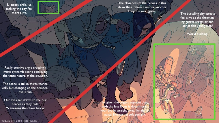
This scene might be my favourite out of my selection here. Firstly the dynamic nature of the scene is maybe its most eye-catching feature. The scene is still divided into a third but with the angle being so uniform. However, this adds to the nature of the scene as this small army of guards march through the area, forcing the heroes to improvise a hiding spot.

The scene does a great job of world building also as we see these guards either arresting brutally or conscripting this younger man. Even though our attention instantly goes to the heroes their eyes draw ours to the chaos below in the well-lit scuffle.

Another important note here is that the group’s relationship is clearly that of a close group of friends, as one is willing to use their own body as a support, whilst the male keeps his hand on the female keeping her hidden even with her curiosity and pity. Its subtle to show their closeness, it clearly identifies them as a party willing to help each other.

Also, the nosey child peeking through the window makes the city feel more alive, as there are always wandering eyes.

Analysis 4 – Looking Worst for Wear

analysis 4

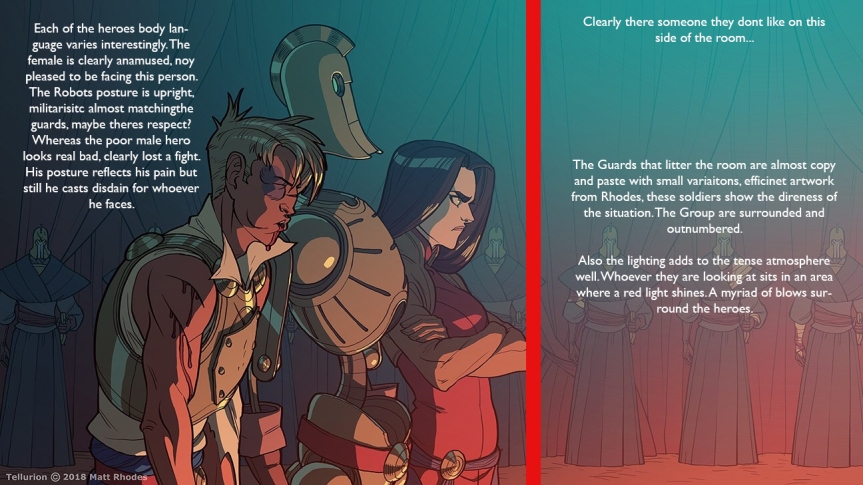
This piece does well to convey the attitudes of the party in this dire situation as the group have been apprehended.

What first is clear is how each of the individual characters reacts in this situation. The Male character has clearly been in an altercation with the guards wearing his injuries with an angrily as he stares down the off-screen enemy. His posture shows how weak he is as he slumps slightly. I get the interpretation he’s still up to fight if it comes to it. I find it odd the other two don’t seem more concerned for him.

The Robot character is oddly posed in this scene. Their posture is upright and arms are at the side in a very militaristic fashion. To me, this almost displays a type of respect to the off-screen enemy. Very contrasting to the other group members.

And finally, the female character has maybe the most interesting posing. She stands upright, arms crossed with a very displeased look. I get the sense she has a history with the offscreen figure, perhaps a strained relationship. The common theory on the forums is that she’s the daughter of the offscreen figure which could explain her attitude. It’s reminiscent of a disgruntled child.

Interestingly the amount of empty space is actually called “Lead Room” or “Lead Space”. Its a technique used to avoid making the scene feel claustrophobic by leaving enough empty space to imply the character is viewing in the distance of that direction.

In the background of the scene a shade of redcoats a line of soldiers who surround the group. Combined with the red lighting, conveying a sense of danger, the guards pose a clear threat to the party.

Mentor Meeting #2

So after feeling quite positive about my first meeting and the development, my project was taking I was eager to continue working. The week had a few days where I felt I made little progress, however, I was able to splice my thumbnails together into an animatic I was quite happy with. I used After Effects as I’m comfortable with the app and I could use the camera tools to direct the viewer to specific aspects of the art to further the story. I also added some music to add to the ambience of the animation.

It wasn’t until I got to the meeting where I began to feel nervous about my animatic. I knew my story, I was able to read the narrative I was trying to form. I had only shown friends my animatic up until this point, I trust their feedback but I worried there’d be bias. Robin had the cool idea to watch my animatic in silence. This was nerve-wracking cause there was just no talking, no way to defend or explain the story choices. But to my relief she read back her notes on her interpretation of my animatic and amazingly shes pretty much had it spot on except for the inclusion of “Energy Vampires”, but it kinda made sense. This was my biggest worry, as a narrative is only strong if it makes sense and it clear. Robin was able to identify key relationship aspects about some of the character even though there isn’t any animation in the sequence, only staging and posing.

The next stage for my animation would be getting a rough script together and having some basic voice acting put into the animation so I could figure out timing and how complex the script could be.

Afterwards, we discussed my Proposal which I haven’t delved into really, she advised me to continue my research and not only into academic readings but also Films, Comic books, and other motion comics. I was to identify examples of staging and composition of characters and how that affected their relationships. I also wanted to look into interesting camera angles and how they can aid in storytelling.

Deliverables for following week – Script, Animatic with Voice Acting, More Research Examples.


Rough Animatic –

So here I compiled all of my Thumbnails into an Animatic using After Effects. (What more do I write?)

I intend on working on a more fleshed out animatic by the end of the semester which will play on the depth tools from After Effects. But for now, this flat animatic still showcases the scenes well and combined with the camera tools I can still direct the viewer’s eyes.